After an 18-month beta in Southeast Asia and Latin America, the Facebook Gaming app released in the U.S. today on Android. FB Gaming creates a hub for the video game content on the social network in an apparent attempt to form a rival to Twitch.
Facebook Gaming seems like a good idea. The app allows Facebook to better leverage user-created video game content by centralizing it away from its increasingly polarizing central product. Facebook is the number three game streaming site as far as hours watched (I wouldn’t have guessed this), but drastically lags behind its competition in hours streamed and unique gaming channels.
It’s a smart move to give creators a hub where their content will be front and center and will likely make the platform more attractive. It’s getting harder and harder to break into Twitch and YouTube, so Facebook might be the destination of choice for those trying to make it big streaming games. At least, it might be if the Facebook Gaming app’s UI weren’t a total disaster.

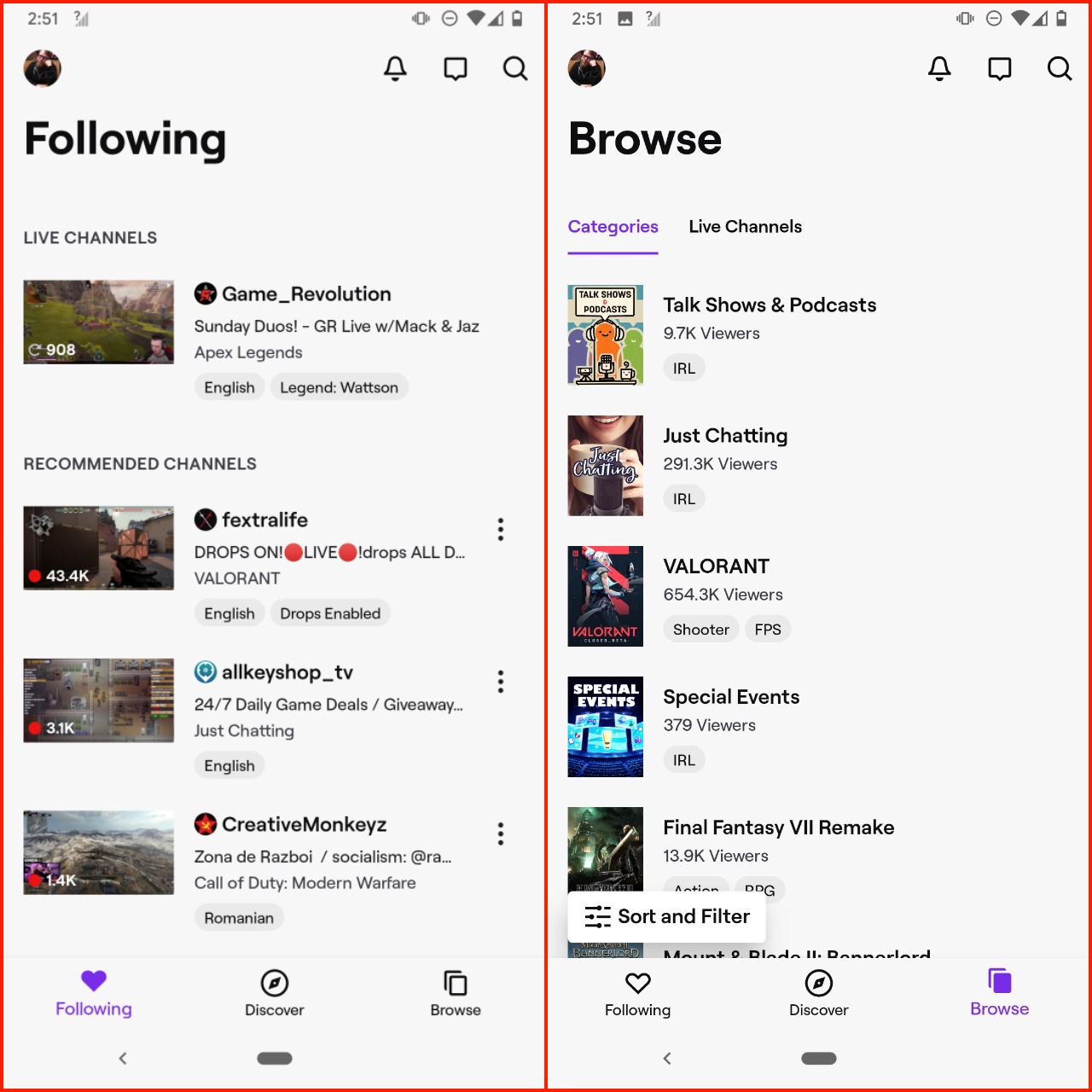
The Twitch app on Android features a straightforward interface. Open it up, and you’ll see any channels you’re subscribed to or following right at the top if they’re streaming. It makes it easy to get into the content you’re most likely to watch quickly. Right under your preferred streamers, you get some recommended. Switch over to the Discover tab, and you’ll get a ton of streams that Twitch algorithms think you might like. If you don’t want any AI telling you what to watch, the Browse tab puts every stream on Twitch in an easy to search format. Regardless of what tab you’re on, though, one tap gets you into a stream, which is crucial.
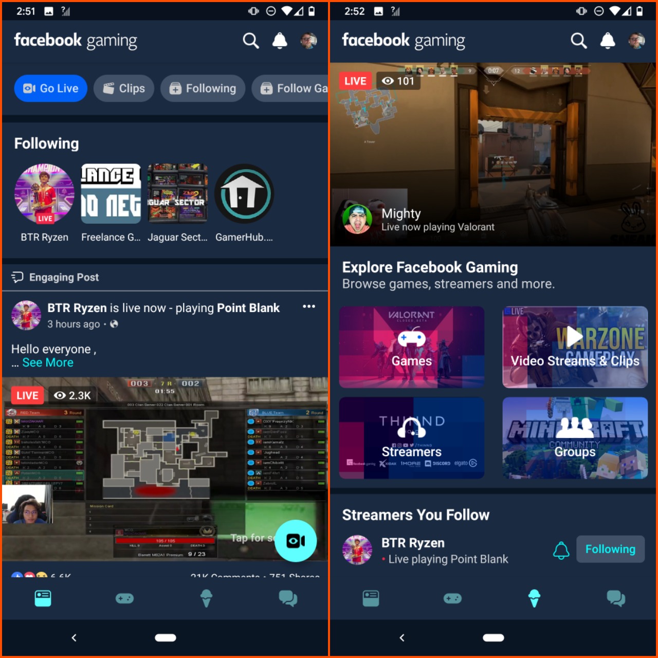
Facebook Gaming, on the other hand, makes it extremely confusing to find content. It follows the Facebook Watch format, which means streams, clips, and VODs are all jumbled together on the first tab. I found that this personalized stream did prioritize accounts that were currently streaming, but it made it hard to find new content, which is what a new platform needs to survive.

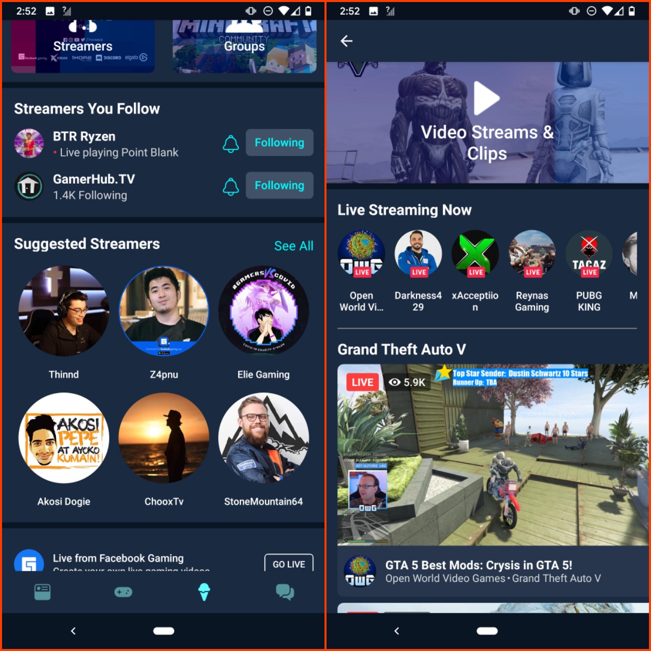
To find new streamers, you don’t follow on the Facebook Gaming app; you need to click on the ice cream cone icon (I’m not sure what significance this icon has). From there, you can get suggested streamers, current streams, recommended games, and suggested gaming groups. However, you only get a small number of recommendations, and the information isn’t displayed harmoniously. If you just want to see live streams, you have to tap on “Video Streams and Clips,” and you’ll finally get a section that allows you to discover new streamers reliably. However, if you want to check streams for a particular game, you have to tap on “Games,” find the game you want to watch (there’s no search feature on this section that I could see), and then you’ll once again get a mixture of clips, VODs, and livestreams.

The UI of the Facebook Gaming app is horrendous. This is essentially a new platform that populates accounts you’ve followed with your main FB account. That’s great if you’re a big Facebook user, but if you’re not already following game-related accounts, this app makes it incredibly frustrating to find interesting content. Facebook can’t rely on its mind-numbing three-minute Watch video format if it wants to be a serious rival to Twitch. People watch game streams in increments of an hour or more, and they want to find creators that entertain them and that they can identify with, which is nigh impossible in the FB Gaming app.
Like past Facebook products (and Facebook itself in many regards), Facebook Gaming doesn’t seem to know what it wants to be. It mostly functions as a gaming-centric extension of the Facebook app with the same functionality and design. However, FB seems like it wants this app to be a serious rival to Twitch, and at the same time, they’ve included their casual game library as well. It seems like they’re trying to brute force their way into the streaming market by converting their sizable user base to using this new platform. However, we’ve already seen that tactic fail with the demise of YouTube Gaming, and Mixer has shown that you can’t pay your way into prominence, even with a platform that’s much more user-friendly than what FB is offering.


