Blizzard is making a bold move with Overwatch 2 and it seems to be paying off already. The community is excited for the upcoming shooter and is actively discussing the new content, with the Overwatch 2 character comparisons being one of the hot topics.
For the sequel, fan favorite characters are returning with brand-new looks. It’s a redesign that may seem slight at first glance but that ultimately contributes to emphasize the unique personality of each hero while adding significant detail to the character models. Blizzard is yet to reveal the new looks of many heroes, including Sojourn, who is making her debut as a playable character in Overwatch 2, but let’s see what has changed with some of the favorites.
Overwatch 2 Character Comparisons | New Overwatch 2 heroes look
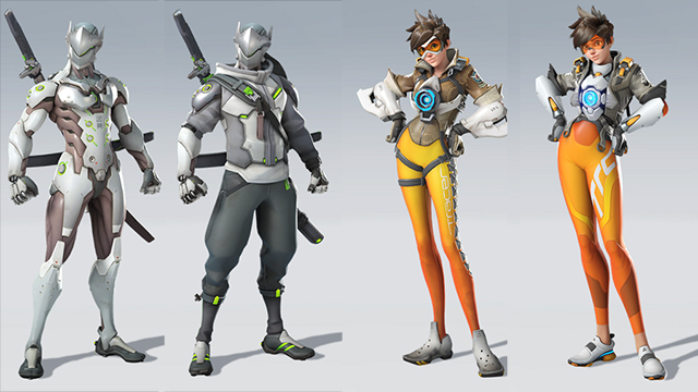
Let’s take a look at what Blizzard is doing with the seven Overwatch heroes that were already revealed. To the left you have the original Overwatch design, and on the right you can find the Overwatch 2 new hero look.
Overwatch 2 Character Comparisons | Mei and Lucio redesigns
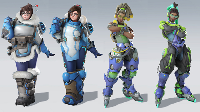
Everybody loves Mei, and the affable Chinese hero is once again bringing her weather-changing devices to the fight. However, she is ditching her fur-coated attire in favor of a more hi-tech suit, with a few neon lights thrown in for good measure. Blue remains as her costume’s dominant color, and her new boots seem to weight a ton. Mei’s hairstyle is now slightly different, bound by a new hairpin that fits into the more futuristic look.
ALSO: Overwatch 2 Release Date and Platforms | When is Overwatch 2 releasing?
Lucio is redesigned from top to bottom, and his crucial roller blades were the subject of a renovation as well. His design feels less cluttered and more focused, with a hi-tech style that is in line with his stylish abilities and energy, resulting in an interesting synergy.
Overwatch 2 Character Comparisons | Genji and Tracer redesigns

While most of the redesigns that Blizzard shared with the community seem to push for a strong hi-tech identity, Genji is going the opposite route. He could ramp up his technological abilities even further or simply go for an alternate costume, but instead he is now sporting a cool new street-smart look. He even has a marvelous hoodie that makes him look even more stylish than he was before, and finally achieves a personality that is far more than that of a character out of Warframe.
Tracer was for a long time considered Overwatch’s poster girl, and naturally stands as one of the top heroes in Blizzard’s game. Her tight orange pants and cool goggles ultimately defined her look, and these features remain, although tweaked in a way that is likely to please fans and once again inspire thousands of cosplayers all over the world. It’s also worth noticing that the crocs are gone, replaced by a much more comfortable-looking pair of shoes.
Overwatch 2 Character Comparisons | Mercy redesign
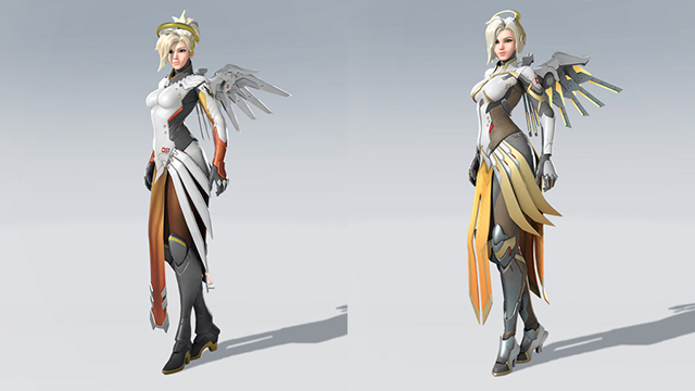
Mercy is the support role of choice for players who love helping their teammates. She is returning in her Valkyrie Suit, but it was the subject of a visual overhaul that adds a myriad of details to the first iteration.
At first glance, not much has changed for Mercy, but this misleading impression is due to the accomplished original design. Further inspection reveals that the boots are now much more detailed, as is the rest of her costume, with some parts showing what appears to be leather. Mercy is also returning with a new hairstyle, just as it happens with Mei.
Overwatch 2 Character Comparisons | Winston redesign
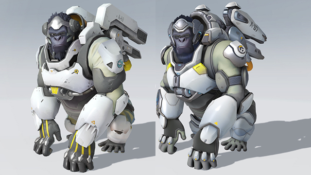
Winston has clearly kept himself busy with new inventions. Mixing brains and brawn in a bid to achieve the endless possibilities that he has always dreamed of, his jump pack is now more stylish and features smoother lines than before.
One feature in particular that is visible in Winston and seems to be shared with the other known Overwatch 2 characters is the softer hair style. It ditches the plastic look of the original game, offering more realistic hair, although still far from what we’ve seen in the best-looking games. Nonetheless, Winston’s new look is probably going to divide his fans, as it doesn’t seem to significantly differ from the original.
Overwatch 2 Character Comparisons | Reinhardt redesign
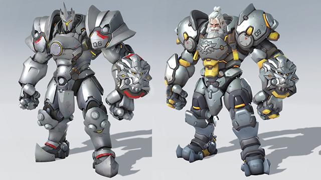
Reinhardt’s new look is inspired by Blizzard’s canceled Project Titan, with a colossal power armor that packs quite a punch. This tank has seen quite a hefty upgrade to his armor, with new details all over the place and the lion head now prominently displayed on his chest as well, besides featuring on his left arm.
Reinhardt’s face now looks more like an aged Geralt of Rivia from The Witcher, something that is extremely cool. Geralt also has this wolf medallion, so there is probably some connection between grey-haired heroes and animal effigies that we’re yet to uncover.
